It’s not often that I can start and finish a project in less than a day. Even if I do, having enough willpower and motivation to write a blog post never seems to happen. I decided, BusBus is coming along just fine and my body needs a break. I love working on the bus, but the physical and mental exhaustion is no joke. Stiff joints. Over analyzing and then re-analyzing the previous over analysis. So today turned into Thrifty Thursday Art Project and I made a sign for BusBus. I’ll walk you through the simple design of and process for creating it!
Why Create a Sign?
For a few weeks now, we’ve been talking about making a sign to direct people to our social media sites for BusBus. We’ve met quite a few people this way and wonder how many we haven’t met yet? It turned out to be the perfect day to make a sign. The weather was rainy and windy, which are not ideal working conditions even under the cover of the almost-sealed bus.
Considerations:
The sign needed to tell people what the bus project is (i.e. a tiny house – though we’ve had guesses of food trucks and mobile workshops!) and where to find more information. The plan was to make it visually appealing and, while not huge, it needed to be legible from a distance.
Cost:
Little to no money. With so many custom projects and capital spent on those projects, we didn’t want to spend a lot of money on the sign. We also didn’t want to add to our “things” or needlessly purchase and consume. Lastly, it should be visually appealing. I’d definitely say it’s ad hoc, but hopefully not haphazard.
Supplies:
- Reclaimed 80-year-old cedar
- We purchased this back in October for $1 per each 1″ x 1′ x 5′ plank and actually had 2 half pieces left over from our composting toilet box. Rot caused one half to break into two pieces.
- White paint from the windows to give us a light background on which to draw.
- Charcoal from my charcoal set
- Paint and paint brushes from Bart’s art supplies
- Pencil to sketch the rough draft
- Scrap plywood form the floor and work tables
Process:
I took the 3 pieces of wood I had in the bedroom/supply room and noticed the rotted area looked really neat because it was also a knot. The pieces organized well together in a stair-stepping design, so I went with it and used 1″ screws to connect the three pieces using two long scrap pieces of plywood, placed diagonally, to connect all three pieces.
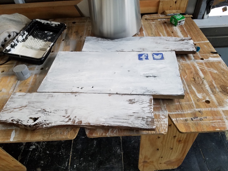
After connecting the pieces, I flipped the sign over and put a coat of flat white exterior paint on the wood. I would have liked to keep the wood natural, but the sign wouldn’t be nearly as readable. A white base was the way to go in keeping things cheap and easy.
Then I painted on an icon for both Facebook and Twitter. We luckily had a blue paint that was pretty close to the Facebook blue and looked great on the white background. Just in case you didn’t know, if you search for “BusBus & Co.” on either site or in Google, you can find us. (Side note: our Facebook page ID had a weird number after it. I figured out how to remove that today and now the link is just /BusBusCo!) This is where I left the project until I got feedback from Bart. I could’ve finished it, but he’s always got great ideas on design, so I waited and what a great decision that was. He had the idea of making the sign look like our logo/business cards. It’s basically the mountainous and cloudy background with BusBus and our name in the foreground with a white background.
With this new direction, I sketched out the design in penciled. The lettering was the hardest as I figured it would be. It looks okay and our design ideas have always centered around simple and low-budget. After the rough draft was sketched, I traced/sketched out the shaped with a charcoal pencil. The lines in the lettering were a bit tedious. All in all, it took maybe 2 hours to make this sign, including designing it. Not bad, huh?
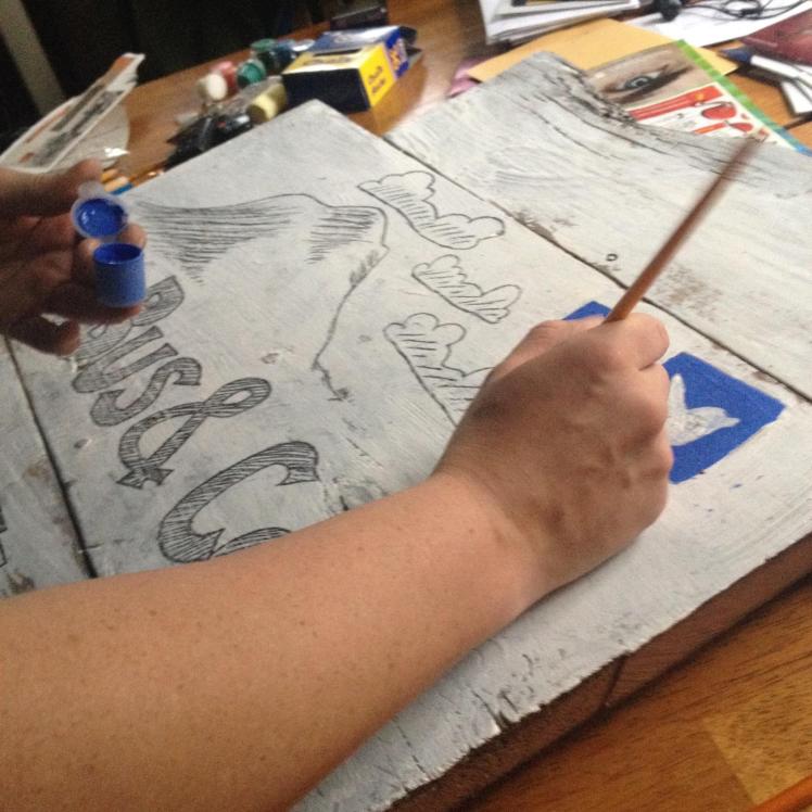
The last design element was also Bart’s idea. We took a compressed charcoal stick and rubbed it along all of the edges with exception to the two nearest the social media icons. Those we painted with the same blue as the logo.
And, voilà:
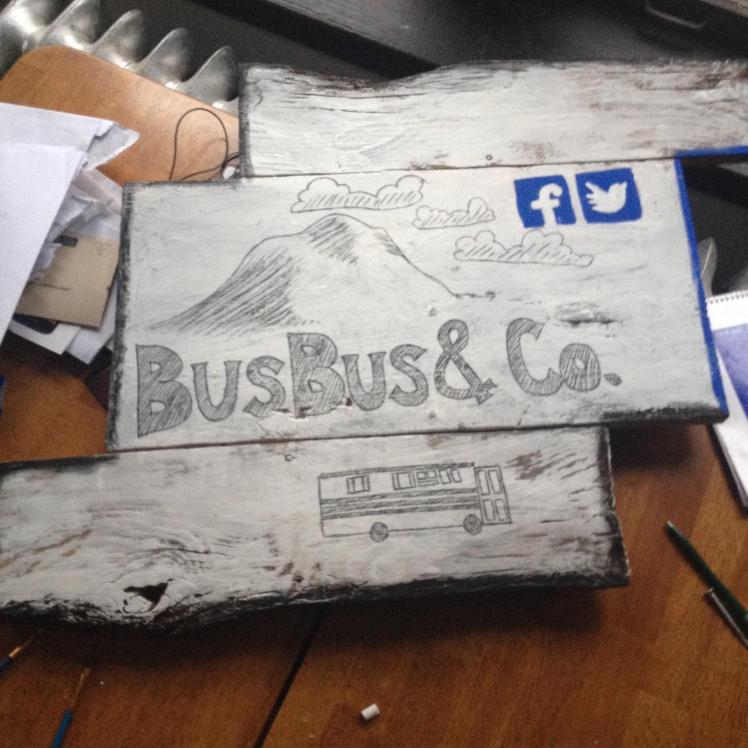
Can you tell I’m right-handed? I was too lazy to draw two straight lines to contain and level the lettering… 😀 Oh yeah, Bart also had a protective coating spray handy. No idea how or why, but it did the trick. Now our sign is ready to be hung up on the street-facing side of BusBus!
I hope you enjoyed this short post. If you have cool sign ideas you’d like to share, we’d love to hear from you. And remember to like us on Facebook and follow us on Twitter if that’s your thang. Thanks for your support!

hope everything is going well!
LikeLike
Enjoyed meeting you two and Sasha, today! (Your maybe new neighbors)
LikeLike